Elon Musk wants to change Twitter’s logo from the iconic bird to something that looks like the letter “X” to show how our flaws make us all special.
In his tweet, he said, “Soon we will say goodbye to the Twitter brand and, slowly, all the birds.”
He didn’t say much about the next plan, but it’s clear that Twitter is preparing for its biggest makeover effort to date.
Musk’s tweet made people who use Twitter and people who follow the industry buzz with joy and anticipation. Elon Musk is also working on a new update that will change the platform’s basic look from white to black.
Elon Musk teased in a subsequent tweet that the business would immediately begin the rebranding the following day if a striking X logo were shared before the end of the evening.
The tweet got a lot of creative responses, and the comment section was filled with different “X” model logos. This suggests that there could be an online contest or another way for the community to help shape the platform’s new look.
Read also: Twitter limits the number of DMs unverified users can send
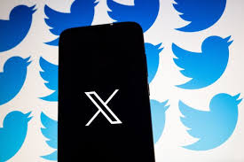
Musk rebranded Twitter Logo
Musk is not completely new to the idea of changing Twitter’s name. Since he took over a big job in the company at the end of last year, he has been working hard to change different parts of the microblogging site.
Recent changes, like putting limits on how often people can tweet, have gotten mixed responses from users and caused a stir in the social space.
This latest news is interesting because it comes just a few weeks after a growing competitor called Threads gave Twitter a lot of trouble. Through spontaneous marketing, the newcomer got people’s attention and got more than 100 million people to sign up.
But according to reports, Threads saw a significant drop in active users within a week, illustrating the social media landscape’s intense competition. It still needs to do a lot of work before it can take over Twitter.
Even though Twitter is changing its name, it is still not clear how this will affect its customers, clients, and advertising. A small change to the brand’s name wouldn’t have hurt as much, but a whole new look might change the way the brand sees itself going forward.
About the Twitter bird Logo evolution
The Twitter brand has undergone several logo evolutions since its inception in 2006, each retaining a unique and subtle aura that sets it apart. In 2012, when Twitter’s iconic bird image was made, a big step forward was taken. At that time, the company’s leaders knew they needed to update the brand’s image, focusing on making it even simpler and easier to recognise.
By 2012, Twitter was used all over the world, and the company’s name almost seemed unnecessary next to the image. So, it was decided to drop the company name, leaving only the famous bird as the main sign. The bird was carefully redesigned to look more balanced and clean-cut.
In this change, the bird’s plumage, which was part of the old design, was taken away, giving the mark a sleeker and more streamlined look. To make it look better, the makers used three circles that overlapped to make the shape of the bird’s wings. Also, they chose a stronger shade of blue, which stands out well against the white background of web pages.
With this new bird sign, Twitter’s brand identity was solidified, and it quickly became one of the most recognisable logos across the internet. The mark is well-known and has stood the test of time because it is simple, elegant, and smartly uses empty space.
Since this iconic bird logo was made, Twitter’s visual identity has stayed the same, making it easy for people all over the world to recognise and connect with the brand. The little blue bird has become a symbol for Twitter. It represents the platform’s focus on short messages, connections, and the ability to send messages that can reach anywhere in the world in an instant.
But thanks to Elon Musk, the days of the subtle hummingbird as the Twitter logo are about to end. In a recent tweet, Musk suggested that he might be looking for a new logo for Twitter, one that has a darker feel than the current avian emblem.